 I received my copy of Wargames Illustrated 285 on Friday and although I haven't read it all yet (still busy decorating like a man possessed) I did get a chance to dip into it. I particularly enjoyed the review of Salute 2011 although it did leave me wishing I'd been able to attend the show.
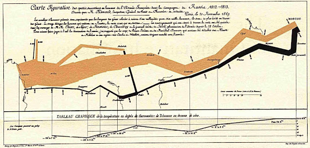
There's a distinctly Napoleonic theme to this months issue with several articles looking at The French invasion of Russia in 1812. One things that stood out was a reproduction of the Carte Figurative by Charles Joseph Minard (available in the Public Domain and reproduced below) which displays a wide variety of information about the advance of Napoleon's army into Russia and its subsequent retreat 1812-1813.
This is an excellent graphical display of information that brutally and clearly shows the diminishing size of the French Army during this ill fated attempt to tame the Russian Bear. The numbers of men present are represented by the widths of the colored zones. The brown represents the men who entered Russia in their progress to Moscow, and the black those who leave it via the long frozen retreat.
I may write more about this issue once I have had a chance to read more but as always there seems to be plenty to keep me happy and occupied over the coming days.

Only just finished reading the last one, this looks good.
ReplyDeleteThat diagram really brings the casualtys into perspective.
ReplyDeleteCan't wait to get my copy now.
ReplyDeleteThe diagram is very interesting, its quite frightening really just how downhill the campaign went.
ReplyDeleteI'll still buy the mag and then moan about all the WW2 stuff in it, just like I do each month......
Whatever floats your boat Ray. I'll ignore your moaning, just like I do each month... LoL
ReplyDeleteI *love love love* that map/graph. As a nerd who deals with data and the conveyance of information every single day, you rarely approach the elegance of the Carte Figurative. I often use it as an example of how great data can be visualized!
ReplyDeleteAnd that is just to the Niemen, not all the way back to Paris.
ReplyDeleteThat's an excellent graph. Were there any good terrain articles?
ReplyDelete